Framing a readable graph
When to write a domain, the defaults left alone, naming a series, the ticks the prose reads, and one meaning per hue.
#The window
#Writing a domain
A domain is written when the window is part of the claim — a probability axis from 0 to 1, a time axis that starts where the story does, a range the argument needs and the data does not reach — and omitted otherwise. Omitted, the graph frames what it draws, each axis on its own; graph documents exactly what it derives. An authored domain is used exactly as written, so one written for any other reason has to be kept in step with the data by hand.
#Axes that share a unit
A circle drawn on axes scaled differently is an oval, and the reader cannot tell it from an oval the author meant. The graph draws one unit of x and one unit of y the same length where the plot is plainly geometry — a shape, a polygon, an angle, a vector, the argand plane, a transform:, a bare function plot — and nowhere else. Where two axes share a unit that nothing on the plot marks, such as a symmetry plot or both axes in dollars, aspect: equal says so, because a reader comparing a distance along one axis with a distance along the other is reading the claim.
#Marks
#size and width as house style
The size, text-size and width defaults are the house style, and a mark that sets them stops matching every mark in the document that does not. A shape's size is the exception, because it is the geometry rather than the weight: a circle's radius, a square's length.
#One declaration per mark
Each mark is declared once. To ring or dim something a cue has already brought in, the cue.highlight or cue.spotlight goes inside that cue: neither changes whether its content is there, so the mark keeps the presence the outer cue gave it. A second copy of the mark, faded in later under a highlight, is the same object drawn twice, and the first copy stays beneath the second for the rest of the scene.
cue{
    circle(x: 2; y: 3; colour: teal; label: P)

    cue.highlight{
        circle(x: 6; y: 1; colour: teal; label: Q)
    }(
        at: 2
    )
}(
    in: 1
)#Naming a series
A line or polygon, and a scatter anywhere but the number line, is labelled from the centroid of its readings rather than from a point on the mark. A series that runs flat and then jumps puts its centroid in empty space, and two series over the same x values put theirs at the same x. Where that reads badly, a labelled point at a real vertex, chosen where the series are furthest apart, names the series, and the series itself carries no label:.
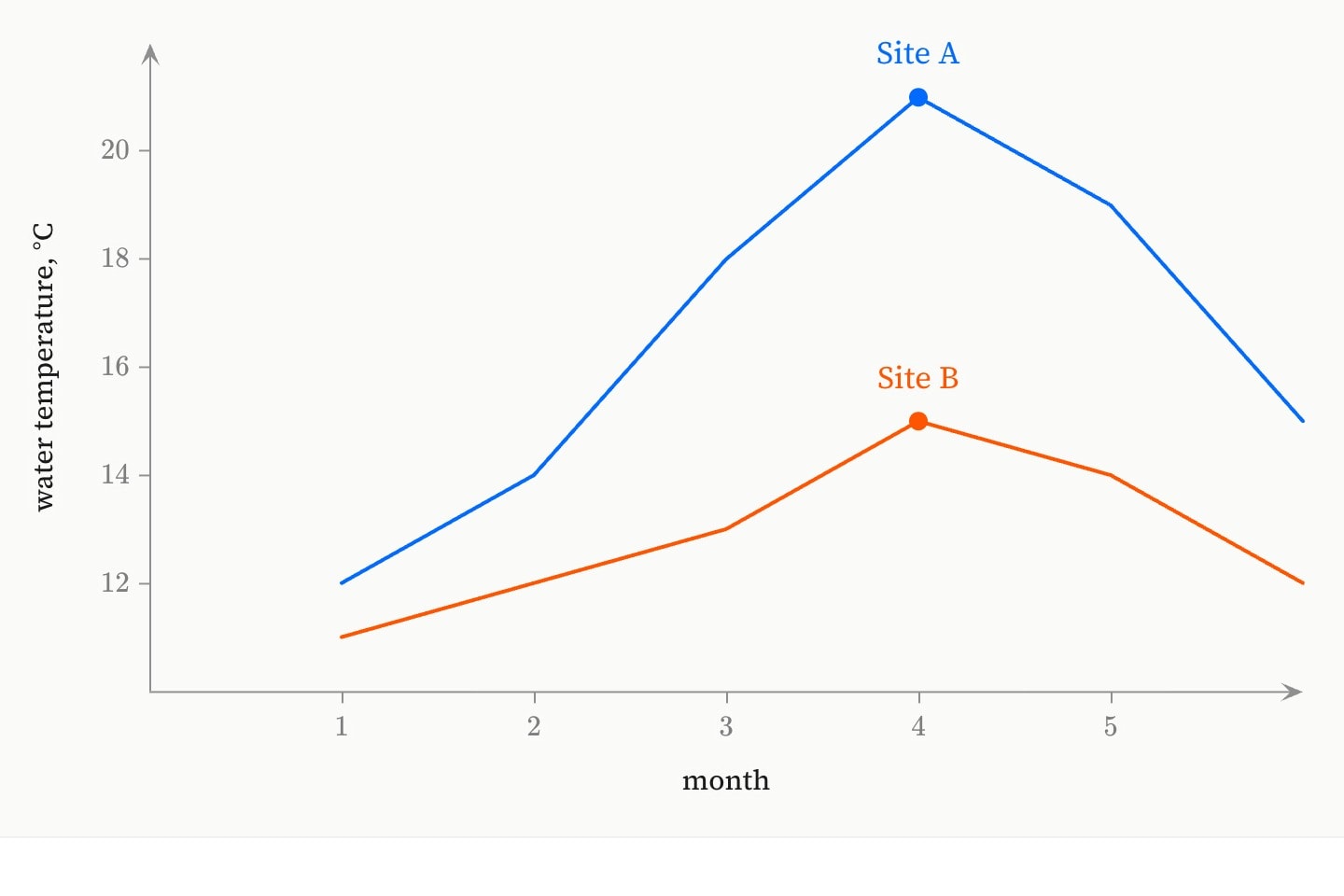
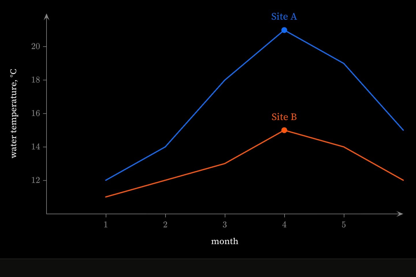
graph{
    line(x: 1, 2, 3, 4, 5, 6; y: 12, 14, 18, 21, 19, 15; colour: blue)
    line(x: 1, 2, 3, 4, 5, 6; y: 11, 12, 13, 15, 14, 12; colour: orange)
    point(x: 4; y: 21; colour: blue; label: Site A)
    point(x: 4; y: 15; colour: orange; label: Site B)
}(
    x axis label: month
    y axis label: water temperature, °C
)#What the reader reads off
#Ticks the argument reads
Ticks stay wherever a sentence asks the reader to read a value — comparing two rates, locating an intersection, introducing a function. A claim that it falls by the same amount each step cannot be checked without the scale, so which ticks a graph needs is decided by the paragraphs written beside it.
Where the numbers are not part of the explanation, !show ticks drops them and axis.label names the values that are, with line to rule each across the plot. A picture with no numeric axis to read at all takes !show background, which removes grid, axes and ticks together.
#One hue, one meaning
A hue means one thing for the length of a document. Teal as the standout reading in one environment cannot be the reference line in the next, and grey as the reference in one is grey as the reference in all of them, because the reader carries the meaning from one canvas to the next. A colour is checked against every environment in the document, not only against the plot being written.
The standout bar in a bar chart is a colour on the one mark, not a second mark: a list in colour is cycled bar by bar, so colour: grey, grey, teal, grey picks out the third. A second series is a second thing measured, and is drawn as one.
An axis.label stands in for the tick it replaces, and keeps the neutral it defaults to unless its hue does semantic work, such as matching the one series it belongs to. A spare colour reached for so the name stands out puts it in the register of the data, next to whatever the data's hues already mean.