axis.break
Cuts an interval out of an axis and closes the axis up around it, marking the cut with two slanted strokes on the axis line. axis.break(y: [0, 60]) lets a series between 62 and 66 fill the plot while the axis still starts at 0. The axis is chosen by which interval is given.
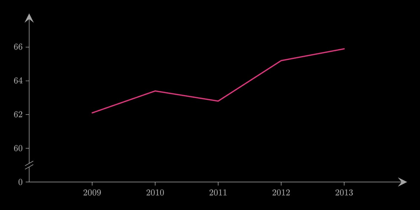
axis.breakxxyplaneAn axis break cuts an interval out of an axis and closes the axis up around it. axis.break(y: [0, 60]) under a series that runs from 62 to 66 lets the data fill the plot while the axis still starts at 0. The ticks read 0, 60, 62, 64, and two slanted strokes on the axis line show where the values were removed. Which axis it cuts is chosen by which interval is given.
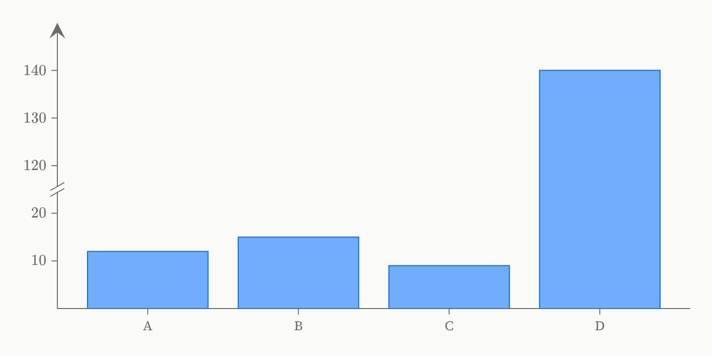
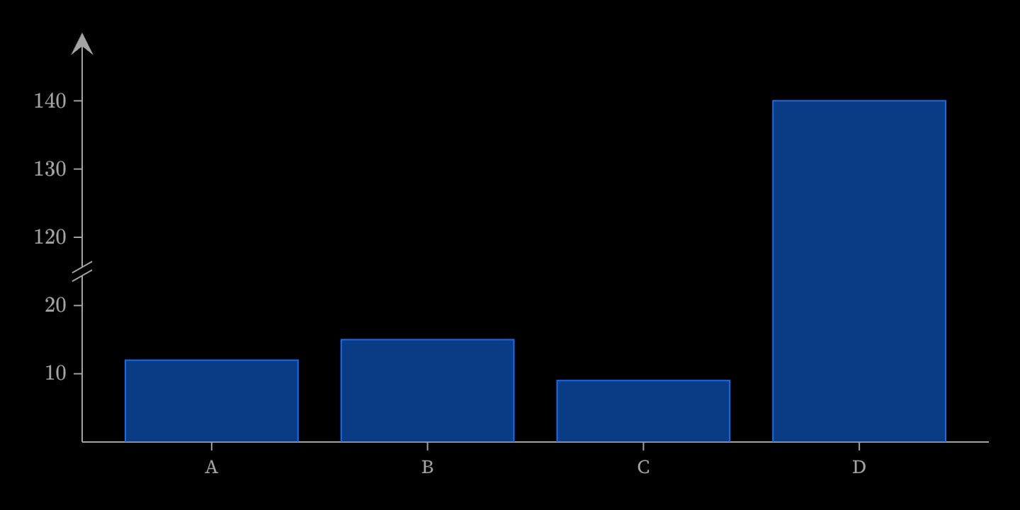
The cut is drawn one grid step wide, so choose ends that fall on ticks: with a step of 2, [0, 60] puts 0 and 60 on neighbouring ticks. Everything past the break moves with it, so a bar from 0 to 140 is drawn across a break at [20, 120]. Use a break on a line or scatter chart that should show where zero is, or to keep one outlying bar from flattening the rest. It works on numeric axes, linear or log, but not on an axis of names.
#Attributes
xxyplaneyaxis.break:value#Allowed in
#Examples
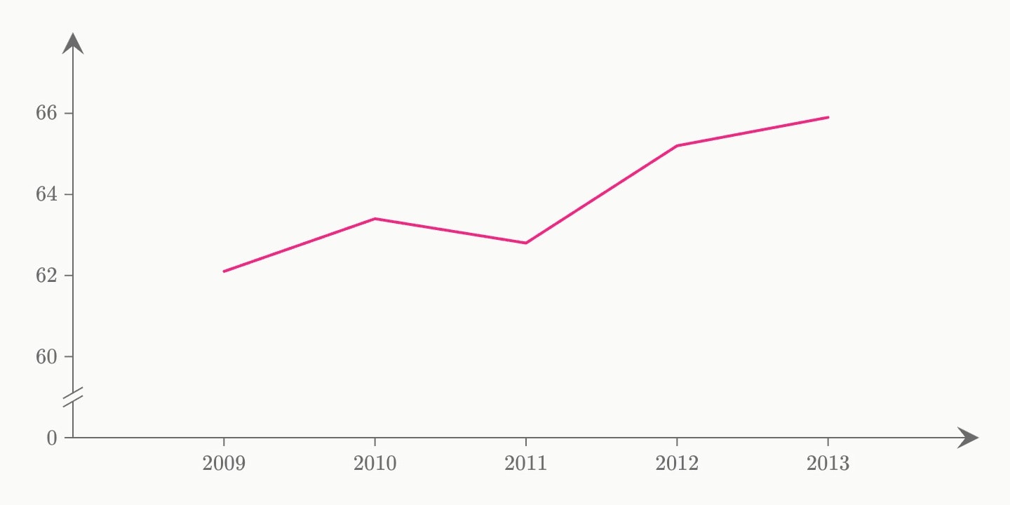
@data#turnout{
    year | percent
    2009 | 62.1
    2010 | 63.4
    2011 | 62.8
    2012 | 65.2
    2013 | 65.9
}
canvas.graph{
    line(x: #turnout.year; y: #turnout.percent)
    axis.break(y: [0, 60])
}(
    x-format: dates
)
canvas.graph{
    bar(x: A, B, C, D; y: 12, 15, 9, 140)
    axis.break(y: [20, 120])
}